
Mollier diagram, part 2: the diagram explained
Mollier diagram, part 2: the diagram explained
– by Jeroen Fijan, 27/03/20
Richard Mollier was a professor of Applied Physics and Mechanics and a pioneer of experimental research in thermodynamics in the late 19th century. He carried out meticulous calculations for every state and property of air.
The result: the emblematic HX diagram.
An easy-to-read tool still in use today. In this issue of our blog, we explain how the diagram works and how to read it.
The purpose of the Mollier diagram
Why make thousands of calculations every time you need to predict the state of a medium? Richard Mollier saved us a tremendous amount of time by making all those calculations for us and instead giving us this powerful tool.
The diagram provides a graphic representation of the relationship between physical conditions and the corresponding changes in the system: the two can be linked simply by drawing some lines and knowing what their intersections represent.
Temperature lines
Constant temperature lines in the diagram are largely horizontal, but slightly tilted. Each line corresponds to a temperature, and they are simple and proportionate – in other words, if you need the line for 21.5°C and this is not indicated in the graph, you can simply imagine a line exactly in the middle between those for 21 and 22°C.
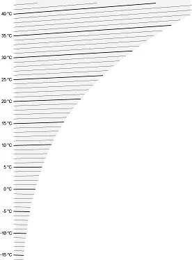
Image 1: Temperature
Absolute humidity
The vertical lines in the diagram represent absolute humidity in grams per kilogram, with a range from 0 to 40 g/kg. They show how much water vapour the air can contain at different temperatures: the warmer the air, the more water vapour it can contain.
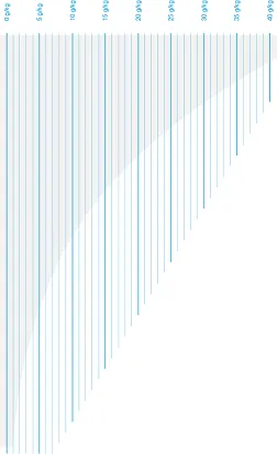
Image 2: Absolute humidity
Relative humidity
The curved lines in the diagram represent the relative humidity of air. As we mentioned above, air can hold a fixed amount of water vapour. Relative humidity is the ratio of existing water vapour in the air to the maximum possible amount of vapour the air could potentially contain.
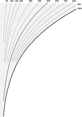
Image 3: Relative humidity
The 100% humidity line is also called the saturation line. This is the maximum amount of vapour that air in a given condition can contain.
Specific enthalpy
The diagonal lines in the diagram represent specific enthalpy, which indicates the internal energy of the air. Again, as with humidity, this is higher when the air is hotter.

Image 4: Specific enthalpy
Air density
The last set of lines in the diagram are the lines of air density, which range from 1.1 to 1.35 kg/m³. Colder air is heavier than hotter air as colder molecules are packed more closely together and thus denser in low temperatures. As temperature rises, the atoms enter a more excited state, and space between them increases, reducing density.
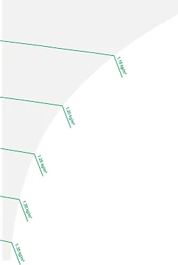
Image 5: Air density
Dew point and wet bulb temperature
The dew point and wet bulb temperature are two important variables that can be read indirectly from the Mollier diagram. The dew point is the temperature at which air starts to condense. The wet-bulb temperature is the theoretical temperature read by a thermometer covered in water-soaked cloth over which air is passed.
As an example, let us imagine an arbitrary state, like 25°C with 50% relative humidity. You can find the dew point by drawing a line from the point where the 50% relative humidity curve intersects with an imaginary line indicating a temperature of 25°C in the graph straight down to the saturation line (which, as you remember, represents 100% relative humidity). The temperature corresponding to this point is the dew point temperature – in this case 14°C.
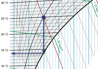
Image 6: Finding the dew point
For the wet bulb temperature, we again start from the point where relative humidity is 50% and temperature is 25°C, but instead of a vertical line, we follow the specific enthalpy line down to the saturation line. The temperature at this point is the wet bulb temperature, or around 18.3°C in our example.
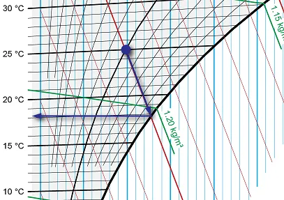
Image 7: Finding the wet bulb temperature
In the next blog, we’ll show you how to make practical use of the diagram by making calculations with it.
Jeroen Fijan | R&D Manager
Jeroen Fijan has been working at Heinen & Hopman since 2001. He started as a draughtsman and, over the years, worked his way up to the top of the R&D division. Sustainability is a top priority in the quest to improve H&H’s products and processes.